14/10/2024 - 21/10/2024 (Week 3 - Week 5)
Aisya Diva Anwagodsa (0365505)
Brand Corporate Identity / Bachelor of Design (Hons) in Creative Media
Task 2 - Logo
TABLE OF CONTENT
LECTURES
Positioning
Positioning is the process of positioning your brand in the minds of the customers. This is referred to as a positioning strategy, brand strategy, or brand positioning statement. (Bueno, 2019). However Willis (2017) differentiates positioning and strategy, strategy itself is long-term planning, and is a map, while positioning is about 'position' or where you are placing yourself 'in the map'.
- Our mission is to make a unique impression on our customers' minds, so they can associate something specific and desirable with our brand, that is differentiate your brand from others in the marketplace (Bueno. 2019).
- Four different styles of positioning by Willis (2017):
- Arm wrestling: Trying to take on the market leader and beat them at their own game. But it takes a lot of time and money.
- Big fish, smaller pond: Focusing on a smaller sub-segment of an existing market (example: Maccentric vs Mac)
- Reframe the market: Reframes an existing market in new terms (for example: Apple, Tesla, and Pandemic.)
- Change the game: Reserved for when there is no market category for what you do. The first of your kind and you get to invent your market (Source). The advantage of this strategy is you'll be the market leader because there's no such thing as your brand before. The disadvantage is without a patent or copyright, another brand could copy your idea or maybe beat you! (example uber/grab)
How do we determine positioning?
First thing first we have to find our uniqueness, something that differentiates our brand from another brand. What is the difference between positioning and differentiation:
- Positioning: a strategic process that marketers use to determine the place or "niche" an offering should occupy in a given market (Lumen, n/d).
- Differentiation: closely related to positioning, but it's the process companies use to make a product or a service stand out from its competitors (Lumen, n/d). There's an element of mental positioning that is driven by the mental or physical presence.
3 questions could determine whether you have a brand or not. Neumeier (2003) states that Greg Gall would demand unambiguous answers to 3 little questions:
Who are you?
What do you think?
Why does it matter?
ps. These three 'little' questions might easy to answer, but at a deeper level, it will be hard if you don't know what is the point of your brand.
There are 7 keys to effectively clarify our position in the marketplace, quoting from Bueno, 2019.
- Determine how your brand is currently positioning itself.
- Identify your direct competitors.
- Understand how each competitor is positioning their brand.
- Compare your positioning to your competitors to identify your uniqueness.
- Develop a distinct and value-based positioning idea.
- Craft a brand positioning statement.
- Test the efficiency of your brand positioning statement.
Four essential elements of a best-in-class positioning statement:
- Target customer: What concise summary of the attitudinal and demographic description of the target group of customers your brand attempting to appeal to and attract?
- Market definition: What category is your brand competing in and in what context does your brand have relevance to your costumers?
- Brand promise: What is the most compelling (emotional/rational) benefit to your target customer that your brand can own relative to your competition?
- Reason to believe: What is the most compelling evidence that your brand delivers on its brand promise?
The tagline/slogan helps to establish the position we are looking to own. Tagline is an external statement used in our marketing efforts. Insights from our positioning statement can be turned into a tagline, but it is important to distinguish between the two." (Beuno, 2019).
Brand positioning statement is for internal use, do not expose it to the public. The purpose of brand positioning statement is to guide give us direction in the marketing and operating decision of our business.
To position our brand in our customer's minds, we have to start from within our business, Every member of our organization that touches the customer has to be the perfect expression of our position. We are only as good as our promise
- Conclusion from Mr. Vinod
INSTRUCTION
TASK 2 A
Logo Research & Analysis
In task 2A we were told to analyze 28 logos, from the type, color scheme, graphical elements, fonts, etc.
This task also requires students to observe the logo, as Ms. Lilian asked us to use the logo in our surroundings. For me, this task helps to sharpen my sensibility of the environment, because while doing this task, I observed a lot and paid attention to things.
Fig. 1.1 Task 2A
(27/10/24)
Task 2B
This task requires students to create a logo based on the business idea that they have decided on at the beginning of the class. The logo should be created in:
1) Logo in BW, reverse & color
2) Logo space rationalization & Clearspace
3) Logo with strapline
4) Logo with rationale (brand ideals)
5) Logo minimum size
6) Brand primary & secondary colors
7) Logo/brand typeface(s)
8) Patterns derived from the logo
9) Logo animation (GIF)
Process
1. Brand
The first thing I did was decide what kind of brand I wanted to create based on questions given by Ms. Lilian. The thing I liked was she gave us the freedom to decide whatever the business and it was very fun because I am able to use ideas that I thought were weird. My final idea was three different businesses that focus on food (mostly). Below is the detailed information about my idea.
Fig. 2.1 Bussiness alternatives
(27/9/24)
After discussing with Ms. Lilian, I chose the rice shop idea. After that, I continue to make a mindmap for my brand.
Fig. 2.2 Mindmap
(30/9/24)
From the mindmap, I can reflect on things I put in there and use it to create my logo.
2. Sketches
I made a lot of sketches at first, as I thought there was a long logo style that I wanted to explore, below are the first 2 pages that I made.
Fig. 2.3 Logo sketches 1
(7/10/24)
In this sketch, I played a lot with the rice shape, but it seems did not work well for my logo. The other thing was I also like to make logo with ribbon and some sort of logo that looks like emblem logo.
After creating these sketches, I decided to go in a new direction by adding a mascot to my logo. The mascot itself was a farmer, as the farmers had the most important roles in the process of rice making. They harvest the rice, take care of the ricefield, and make sure that the rice is in good condition before they send it to the factory.
Fig. 2.4 Logo sketches 2
(14/10/24)
It can be seen that I try to use different styles in applying the farmer. The thing is I put a lot of details in the logo, Ms. Lilian said details might make the logo cannot survive as the logo. So I had to simplify the logo. Honestly, I really liked the number 6 logo, the visual, and the idea were imprinted on my mind. However, I had another idea by using logo number 2 as the guidance for further exploration. So the final idea was to use a logo with the mascot as a center point, the mascot itself was inspired by my grandfather.
3. Digitalization
For digitalization, I focused on 2 logos that I think have potential. Actually, the logo in Fig. (2.5) was very nice and visually appealing to me, but I have not found ways to make it good as a logo. However, I still tried to digitalize it along with the mascot logo, but in the end, I decided to continue with the mascot logo for this task.
 |
Fig. 2.5 Logo number 6
(21/10/24)
|
 |
Fig. 2.6 Digitalization exploration
(21/10/24) |
First attempt:
This is my first attempt at digitizing the logo, as I said previously, the mascot was inspired by my grandfather, so I asked him to send me his picture. My grandfather is very old now, but I fell in love not-so-old picture of him, I think it's suitable for my logo.
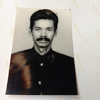 |
Fig. 2.7 Reference for the mascot (My grandfather <3) (21/10/24) |
 |
Fig. 2.8 The mascot with clothes
(21/10/24) |
For the clothes, I used traditional clothes from Java, called 'Beskap' there are a lot of versions of Beskap. However, some farmers would use this type of Beskap as it looks simpler and the material is not thick.
 |
2.9 Logo first attempt
(21/10/24) |
Based on the reference, my main focus was the mustache. In the first attempt, I tried to make the mascot look slightly older than the reference by adding wrinkles. But It was not good for the logo, because when I shrink it, I cannot see the other face features properly. I also added shades onto the ribbon, there were a lot of things that happened on the logo, and the detail on the stripes makes it even more complicated.
The second attempt:
I got rid of unimportant elements, such as the wrinkles, shading, and the rice (Ms. Lilian told me to just put 1 or 2 rice). I also changed the background and frames. Previously it was a circle, but then I changed it into oval oval-shaped frame. Also the font, I decided to change it as well and separate the name from RICESTORY to RICE STORY.
 |
Fig. 2.10 Mascots
(27/10/24) |
In Fig. 2.7 I also tried to change the face shape before finalizing the mascot, I also used the hat as a guide for the mascot proportion. The face second face shape was way different from the reference so I decided to use the original face shape and refine it.
 |
Fig. 2.11 Rice
(27/10/24) |
It can be seen in Fig. 2.8 that the rice on the left was the old one and I made the shape of it simpler.
 |
Fig. 2.12 Final logo
(27/10/24) |
For the pattern, I used rice grains and the leaf.
 |
Fig. 2.13 Pattern
(28/10/24) |
After done, with digitizing the logo I started to set up the documents and created different versions of the logo.
4. Document Setup
While setting up the document and getting feedback from Ms. Lilian. I got things that I should improve from my logo because when I reversed the logo, it looked like there was something that distracting. It was the extra lines. For instance, in the smile of the mascot, the line was extended so it would peak through the mustache. It also happened to the rice stem, so I need to get rid of it.
 |
Fig. 2.14 Mouth outline that extended
(28/10/24) |
After fixing up the smile, I also adjusted the thickness of the line strokes as I got feedback on that particular area.
 |
Fig. 2.15 Comparison before & after
(28/10/24) |
It can be seen in Figure 2.15 that the frame (oval shape and the plate for the brand's name) was thicker after I adjusted it. I also changed the thickness of the; face, ears, and neck (same thickness), face features (same thickness except the eyebrows), hand, and fingers. After done with all of the adjustments, I started to set up the file, but I did something that I was not supposed to do, FORGET TO ADD GREEN TO MY LOGO T-T. I just realized it after I submitted the whole PDF and got feedback from Ms. Lilian days after submission :(, it was a clumsy (more like fatal) mistake and I hope it will not happen again. My logo is supposed to look like Figure 2.16 (left) but I forgot to add the green color in the background.
 |
Fig. 2.16 Logo with the right color (left)
(6/11/24) |
 |
Fig. 2.17 Document set up
(28/10/24) |
5. GIF:
As for the gif, I only use simple animation by giving minor movements to the hand and body.
 |
Fig. 2.18 GIF making
(28/10/24)
|
 |
Fig. 2.19 GIF making
(28/10/24) |
Before I imported the file into After Effects, I made sure to separate the elements and place them into different layers, it helped me to edit the movement for every element. I utilized rotation and scaling the elements to create GIF.
6. Final Result:
Document set-up
Fig. 2.20 Task 2B PDF
(28/10/24)
GIF
 |
Fig. 2.21 Rice Story GIF
(28/10/24) |
FEEDBACK
Week 2
Specific Feedback:
The catering owner/restaurant owner is not suitable for the target audience because the store's concept is selling quality food.
The brand mindmap still needs to be improved, because some of the items added in there are more suitable for the business mindmap (like logo, color, font, etc
Week 3
Specific Feedback:
Try to simplify the logo.
Put necessary things inside the logo, don’t put too many ornaments.
Consider adding the farmer inside the logo.
Week 4
Specific Feedback:
Make the logo simpler.
Use Serif font
Week 5
Specific Feedback:
Separate the word Ricestory into Rice Story
The outline needs to be thicker
The stroke mode needs to be changed
For the padi elements need to be simplified
Week 6
Specific Feedback:
The logo needs more adjustment on the face feature, especially the smile strokes. It extended and peaked through the mustache making the inverse logo look weird, the same thing with the padi stem.
Adjust the weight of the stroke
REFLECTION
Experience:
Throughout this task I learned about the art of noticing, that is one of the things that I realized besides learning how to analyze a logo (Task 2A). Analyzing has never been my favorite thing to do, but by analyzing logos I got new insight as a design student and found interesting meanings from every logo. The experience of designing the logo itself was fun, especially when I could utilize my ideas and involve things that I like, honestly, the idea for opening a rice shop was the continuation of my previous project in Advanced Typography, seems like I'm too attached with rice, because since I sometimes think about rice.
Observation:
I should be more considerate and double-check my task before submitting it and because this task requires me to improve my logo every week, sometimes I get too attached to refining my logo based on feedback until I forget to do things that I'm supposed to do to my logo. Time management is also very important, even though I still find it hard, I will try to push myself to be more diligent and good at it.
Findings:
Throughout the process, I found new things not only from my lecturer but also from my classmates. Hearing other's opinions also helped me to improve and I think the best thing about my learning experience was able to hear different opinions from others and give our opinions to others as well.
FURTHER READING
7 minutes read
This article talked about how the perception of a brand is raised based on the customer's opinion, thoughts about the brand, reputation, and other things that came from customers' experience. A good example here is Volvo (which was used as an example in the lecture video), a car brand that underwent an image revolution, where people used to make fun of people who owned Volvo, but after improvement by embracing authentic, sleek, minimalist, and fashionable Scandi-chic without losing its safety reputation, Volvo made it to be on of the competitor of Audi, BMW, and another luxury brand.
It also mentioned that brand perception involves visual, auditory, olfactory, taste, and emotions. Where these things are ended up in customers/target perspective and experience. And how to measure brand perception, as a brand we have to communicate or show that we care about our customers, considering reviews based on customers' experience is a must, also a brand has to measure what is important and what drives increasment/improvement for the brand.


Comments
Post a Comment