Exercises - Packaging Analysis & Making Packaging For a Product (Packaging & Merchandising Design)
Lectures
Lecture 1 - Introduction to Packaging
Packaging itself known as an element that protect the products for a long time. Usually it will appear in a form of a container, boxes, or wrapper. But nowadays, besides to protect selling products, packaging also function as a promotional material that help brands attract customers in the market.
Packaging design itself is the process of how to make the packaging looks appealing and represent the brand personality, but in design packaging is not only about good look, design packaging also consider the functionality. For example during the class, Mr. Shamsul asked us to write down some points about packaging that will help customer buying product:
- Tracking purpose: Some packaging use a barcode to help customer identify the realness of the product (example: Labubu).
- Awareness: Some products usea specific design to help people with special need to open the packaging (example: Rare beauty).
- Eco-friendly/recycle label: Help to inform customers that the packaging made from eco friendly material, which can be past of the unique selling point as well.
Other than function and uniqueness, packaging has been exist since a long long time ago, below is some of the things about packaging in the early era:
- Packaging was made from natural materials like leaves bark, coconut shells, bamboo, and animal skin to wrap the items
- In the past, people form China and Egypt will used clay pots to store oils, grains, and spices.
Evolution of packaging based on civilization:
1. Early civilization (Mesopotamia, Egypt, and Rome)
- Glass bottle and clay amphorae to store olive oil, wine, and medicine.
- Romans using clay seals to label their containers, now we call it branding.
2. 21st Century (era of sustainability & digital)
- Focusing om eco-friendly packaging (biodegradable, recycleable, and less plastic) this idea were influence by the current situation where humans started to realize that plastic based and other material that is hard to decomposed will take a lot of time to be removed from earth and if we're not trying to find solution it will damage earth.
- Smart packaging that employs QR codes and NFC tags to give interactive experience to the customers.
Things to consider in packaging:
- Target audience
- Product positioning
- customer experience
- Material
- Ease of use
- Sustainability
- Balance in function and aesthetic
- Physical protection
Lecture 2 - Box types & styles
In packaging, we have different type of boxes that works differently and have different function as well. There are about 6 common type of boxes that usually used in this industry:
- Folding cartons: used for cereal packaging, tea, etc.
- Rigid box: the material is sturdy and usually used for exclusive product or something that's heavy and need extra support.
- Set-up boxes: another name of rigid box.
- Cardboard boxes
- Corrugated boxes: the common brown boxes that we see for receiving package, typically has 3 layers that are wavy or similar like sandwich's layer. I use this material for making one of my packaging in project one. My experience from using this material is to consider in the making of the dieline, we need to consider the thickness of the material and make sure to include it to the die line measurement or else you can get issue in folding and the result won't be as what you expected, like it's too narrow or not be the exact as you expected.
- Paperboard boxes: Paperboard boxes are typically a single layer of thicker paper stock.
RTE & STE
- Most common box styles are tuck top, there are reverse tuck end (RTE) and straight tuck end (STE). Usually type of boxes that using this style will be made of art card ranging from 190 gsm (for light products) and 360 gsm (for heavy products).
- Reverse tuck: The direction for closing are the opposite, top part (front to back) and the bottom (back to front). Industries that are common to use this type of packaging are health and beauty, pharmacy, electronics, and nutraceutical.
- Pros of RTE: cost effective, easy to assemble, has compact storing, easy to unpack the product, good for light weight products.
- Cons: doesn't work really well for heavy products and doesn't look aesthetic.
- STRAIGHT TUCK
- The direction for opening the packaging are from the back to front (or oppsite), works for both top and bottom. This type of style is common to used in health and beauty industries.
- Pros: More luxurious (because there's no raw white edges appear at the front of the box), prevent to blocking the packaging's window, easy to assemble, saving space, good for light weight products, easy to unbox.
- Cons: expensive (need more material because of the pattern) and not goodd for heavy products.
- TUCK TOP SNAP-LOCK BOTTOM
- This type of box is also called a 123 bottom because to lock or close th ebottom part only need 3 easy steps. This type of box is commonly use in health and beauty, toys, foodm, and pharmaceutical.
- Pros: Works well for heavy products, quick to assemble (3 steps), compact storing, sits well on the shelf, because the bottom is flat.
- Cons: More expensive (because the die line is more complex compared to tuck box) and needs more time to assemble.
This type of box is used in our final project, and it took us a lot of error and trial to make it right and work.
- TUCK TOP AUTO BOTTOM
- Way easier to set up the bottom part of this type of packaging this type of box is commonly used in health and beauty, toys, food, and pharmaceutical.
- Pros: Works well for heavy products, can be assembled in a minute, compact storing (can be flatten), sits well on the shelf because of the flat bottom.
- Cons: More expensive because needs to glued the bottom.\
- CLOSURE TYPES FOR THE TUCK TOP BOX STYLES
- Has a slit-lock at the flap to prevent the top of the packaging from bowing or denting.
Lecture 3 - Packaging & Branding
Like mentioned in the first lecture, packaging is not only function in protecting the product but now it became part of identity of the product. As packaging became part of the branding strategy, a lot of brands using unique designs to differentiate and show try to show their superiority in order to attract customers attention and derived trust to them.
Below are main points that became the importance of packaging in product branding:
- Attract attention and Differentiate the product from others
- Builds brand identity and recognition (selecting brand ambassadors that align with brand personality is also important)
- Communicate brand message to the customer
- Influence customer perception
- Support marketing and promotion
Consistency in brand packaging is also important in branding, because being consistent will make the brand easy to recognize by the customers.
Exercises 1 - Packaging Design Analysis
1. Gula Nira Comel
 |
| Fig. 2.1 Gula Nira Comel |
Gula Nira Comel is a Malaysian brand of solidified sugar that is made of coconut or aren sap. This product is usually used for cooking sweets.
- Functionality: Gula Nira Comel is a product that sells solidified sugar. The packaging was made of plastic, which is good at protecting the goods inside, but can easily melt the sugar if the product is stored in a hot place (The store where I bought the product places this product on a room temperature shelf, and some of the products have already melted). So, using plastic might not be the best option, because during shipping, the products can be melted easily too.
- Aesthetic & Visual: Aesthetically, the product does not resemble a good visual, the layout feels rushed, like all of the contents are just dumped on the label. The use of the picture that overlaps with the brand's name is distracting, as the color of the font and the picture do not contrast obviously. The logo usage also needs to be fixed; the outline of the logo seems unnecessary, which can be gotten rid of. Also, we can see that the information is not well structured, the expiry date is not visible because of the color (insert picture). Overall, the design can be improved by focusing on the hierarchy.
- Sustainability: The packaging is made from plastic, which is not environmentally friendly
- Branding: As the product is a cooking ingredient, this brand would primarily target housewives and people who enjoy cooking, and the branding that this product wants to convey is 'approachable' and 'friendly' for their customer, because this product is originally meant to be something that common and easy to get.
Market Research:
Gula Nira Comel is a solidified sugar product made from coconut or areca sap, which is commonly used in Southeast Asian cooking and desserts. The name “Comel” (meaning “cute” in Malay) gives the product a unique, catchy, and friendly brand identity, so customers, especially Malaysians could remember and think about this product because of the unique name. Based on the name and type of product, the target market can be divided into several segments:
- People who are interested in natural, traditional, or artisanal products. Many in this group enjoy buying local and want products that feel nostalgic yet modern.
- Mothers and families who prefer healthier sugar alternatives for cooking and desserts.
This product is sold at reasonable prices, and most of the products like this are usually available in modern markets, but not part of high-end products (some products are well packed and have a higher price because of their design and quality).
Competitor analysis:
 |
| Fig. 2.2 Emma Gula Nira |
- Emma Gula Nira is one of the products that came from the established brand Emma. This brand not only sells sugar, but also other cooking ingredients like coconut milk, and has other food and beverage products. Compared to Gula Nira Comel, this brand is pretty much superior, because they have a certain website that helps customers to know better about this brand. The design is also well considered, it can be seen the packaging shows a better arrangement of information, with the logo and picture placed in the center, making the consumer notice the brand. And the rest of the information is placed on the side, making it easy to read and not bothering the presentation of the brand in the label.
2. Tepung Goreng Pisang Adabi
 |
| Fig. 2.3 Tepung Goreng Pisang Adabi |
Tepung Goreng Pisang Adabi is a cooking product that is purposely made for making banana fried batter. Adabi itself is a well-known brand that sells many cooking products such as cooking flour, sauces, and spices.
- Functionality: The product contains 250 grams of flour, which is the ideal amount for one time frying banana (one pack can be used for 6 - 12 ripe bananas). The material of the packaging is made from plastic and is lightweight, making it easy for customers to carry the product. At the top and bottom edges, the packaging has a zig-zag cut that will help buyers to tear the packaging without any hassle.
- Aesthetic & Visual: On the front side of the packaging, there's a big text of the product's name and the logo centered. In the front, they also put vertical lines accent, a halal label, information about the company, and a window under that product's name so people could see what flour was inside. However, the product could be better by using a picture of fried bananas as a resemblance to the flour's result. The backside shows detailed information about the ingredients, barcode, and steps of how to use the flour that exists in two languages (Bahasa Melayu & English).
- Sustainability: The plastic material is not sustainable at all, but it can be recycled into something else, but it depends on the customer, and usually, packaging for flour is not made of recycled material.
- Branding: Given its role as a cooking ingredient, this product mainly appeals to housewives and cooking enthusiasts, and for the branding, they use traditional branding and with the trusted Adabi logo, they also use warm colors to give a sense of familiarity and trust to their customers.
Market Research:
Tepung Goreng Pisang Adabi's presence in international markets, including Indonesia, Thailand, Singapore, China, and even parts of Europe and Australia, indicates a broadening consumer base that appreciates Malaysian culinary products. Below is the target market for the product:
- Home cooks and families seeking convenient and reliable batter mixes for traditional snacks like banana fritters.
- Working individuals desiring quick and easy solutions for preparing familiar Malaysian treats at home.
- Small food businesses and street vendors that are looking for consistent batter quality to serve their customers.
- Export markets, particularly in neighboring countries such as Indonesia, where the product has gained popularity.
Competitor analysis:
 |
| Fig. 2.4 Tepung Goreng Pisang Nona |
- Tepung Goreng Pisang Nona is one of the competitors of the brand Adabi. For the visual, this brand has clearer communication by placing a picture of a fried banana so the customer could see the result of the product. The target audience of this product is also similar to Tepung Pisang Goreng Adabi
 |
| Fig. 2.5 Tepung Goreng Pisang Nazri |
- Nazri Tepung Goreng Pisang, on the other hand, this product is the opposite of the brand 'Adabi' because if we see from the packaging design, it does not visually convey the function of the product. By placing only a banana in the front of the packaging, it makes it not appealing, and the word 'Tepung' can be bigger instead of emphasizing 'Goreng Pisang'. However, the big window in the front is good, so customers can see the condition of the floor inside.
 |
| Fig. 2.6 Twin Tower Appalam |
- Functionality: The packaging is made of paper and sealed with glue on the back it. The purpose of using paper as the packaging is to keep the product crispy and to protect it from moisture. But when I see the product, it has a similar shape and feels like a dumpling wrapper, but appalam is thinner and has a crispy but still have a little bit of flexibility. Even though the usage of the paper material has a good purpose to keep the quality of the product, the idea of using glue for sealing the packaging is not good, because it makes the paper stick to the product itself and is not safe to eat.
 |
| Fig. 2.7 The paper stick onto the product |
- Aesthetic & Visual: The visual of this brand does not convey the product at all. Because when I saw this product for the first time, I thought this product was a firework. It's because the picture that they use is the twin towers and fireworks, and there's the brand name circling the picture. The brand might consider changing the visuals. However, the back of the packaging has reliable information about the product, so if a person sees this product for the first time and doesn't have a clue what it is, they still could figure out that this is a food product by looking at the back of the packaging. The size of the packaging was made to fit the product, so there was not enough space to put the steps on how to cook this product. Looking at the low effort on the packaging design, it seems like this product has a certain target, which is people who are similar to this product and how to cook it, since this food is an Indian food. But still, it would be better if they could improve the packaging by changing the visuals with the product's picture and adding steps on how to cook it.
- Sustainability: The packaging was made of paper with a glossy surface, which not consider as a sustainable material because it contains plastic to make the glossy look.
- Branding: Twin Tower Appalam has a specific target audience, which is Indian households. It can be seen from the way they delivered their product through the packaging design. For the branding, this product seems to use a cultural approach and by using the twin towers, they want to be known as a familiar Indian product in Malaysia for Indians who live in Malaysia so they could still be connected with their culture.
 |
| Fig. 2.8 Front Packaging |
 |
| Fig. 2.9 Back Packaging |
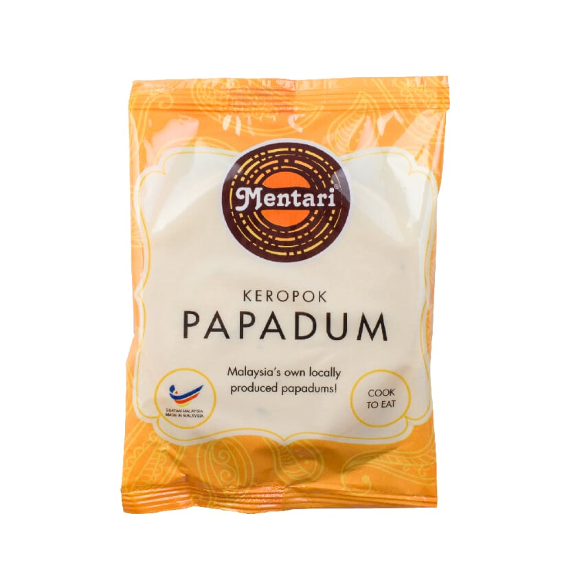
- Keropok Papadum Mentari, this product has a modern look and seems approachable for the varied target market. This brand also has proper brand presentation with a proper logo and clear explanation for the product by placing the words 'Keropok Papadum' so people would have an idea that this product is a food product without looking at the back of the packaging. This product also uses plastic packaging, which could protect the product from water and keep the crisp. The best part is that this product includes steps on how to cook the 'Keropok'
 |
| Fig. 2.10 Keropok Papadam Dapur Desa |
- Dapur Desa Papadam is an example of a product that uses plastic for the packaging. However, the design still can be improved. But packaging-wise, this brand has a very well-executed packaging design in functionality. The plastic material has a zipper so the customer can seal it after frying the product. This will protect the rest of the product inside the packaging without moving it to another container.
 |
| Fig. 2.11 Kering Kentang Dapoer Miuti |
- Functionality: The packaging is made of plastic with a zipper, so it could be used without moving the product to another container, while keeping the quality of the product. There is no back packaging design. All of the information was squeezed in the front of the packaging on a sticker. The design of the sticker itself can still be improved. From the sticker label, it can be seen that this product came from a small business/home business, because it doesn't contain a halal label or detailed information about the production or nutrition facts, and the design is also still using manual handwriting for determining the weight and expiration of the product.
- Aesthetic & Visual: Visually, the design is far from good; many details can be improved. For example, blurry pictures and edges that are not done neatly. In the bottom right corner, there's a potato illustration, and the shadow seems unnatural, while the logo and the brand's name don't reflect the brand identity. The logo represents a serious and seems like it's a product that has a recipe that has been passed down from generation to generation, but the brand name 'Kering Kentang' gives a youthful and bubbly presence to the product.
- Sustainability: As it is a common plastic packaging, it's not sustainable.
- Branding: The product's branding depends on the logo itself, because from another aspect of design, no element makes the branding stronger or becomes the identity of the product. In fact, there are plenty of business that sells this kind of product, and the success of this kind of product usually relies on the loyal customers because of the taste and quality, while the appearance is not the priority.
- Indonesian households that enjoy spicy foods.
- People who like convenience and storing side dishes for daily food.
 |
| Fig. 2.12 Kentang Mustofa Mak Sanon |
- Kentang Mustofa Mak Sanon is a similar product to Kering Kentang Dapoer Miuti. Design-wise, this product has a better arrangement of elements and an aligned brand identity application on the design. The logo is friendly by making the illustration look simple and more cartoonized compared to Kering Kentang Dapoer Miuti, which has a realistic illustration. The logo matched with the font selection for the product's name, and the information about the product was also well arranged, even though there's room for improvement.


Comments
Post a Comment