Advanced Typography - Task 3: Type Exploration & Application
15/5/2024 - 29/5/2024 (Week 8 - Week 13)
Aisya Diva Anwagodsa (0365505)
Advanced Typography/Bachelor of Design (Hons) in Creative Media
Task 3 - Type Exploration & Application
JUMPLINK
LECTURES
Fig. 1.0 Proposal
(17/6/24)
Proposal Ideas:
For the proposal, I made 2 topics. From the two issues, Mr. Vinod thinks that the first topic, creating pixelated font was too mainstream. Because there's a lot of font that is inspired by pixels, I was unsure about using the first topic for my final task. So I came up with a second idea, to create a typeface inspired by rice. Honestly, this idea came up last minute and I was not confident with it. However after I showed my proposal, I got feedback from Mr. Vinod, and I think this idea is suitable for my final task.
Process:
Adobe Illustrator
The first thing to do, I went to the internet and try to find a typeface that was made of rice shape as a reference. Then I found this typeface. It has shapes like puffed rice, I use that typeface as a reference, but my plan is to use the shape of uncooked rice.
 |
| Fig. 1.1 Puffed Rice Font As Reference (17/6/24) |
.jpg) |
| Fig. 1.2 First Attempt (17/6/24) |
This is my first attempt, I used the shape of rice and then traced it using a pen tool (pic 1) to build my typeface, I also used another typeface as a base. Fortunately, It was a wrong move. I am supposed to create my own base using a grid structure. So I redo the whole uppercase. Mr. Vinod told me to keep the arm and leg shape of the letter 'E' to continue creating the typeface. In pic 3, I decided to play with the shape of the rice, but I did not like the result.
.jpg) |
| Fig. 1.3 Second Attempt (28/6/24) |
On the second attempt, I was still stuck in creating the uppercase, the first pic was my whole progress. My artboard is full of shapes and it kinda distracting me.
Explanation:
- The first picture shows the progress of uppercase from A to Z, the colored font on the left was the previous attempt that I think is still suitable, so whenever I did something wrong while finalizing the letter, I still can fix it by looking at the previous attempt.
- The second pic was part of the font that I should get rid of because based on Mr. Vinod's advice, it would be better if I get rid of the 'thing' in the blue circle.
- Picture number three and four were the complete letters. But, I think the shape was not consistent enough. So what I did was change the base shape, which will be shown below.
.jpg) |
| Fig. Refining The Typeface (15/7/24) |
This is the documentation of the finalization of my typeface.
- Picture number one was the new shape of rice that I used, to create a circular shape I rotated the shape a little bit, and then placed it following the structure I had created. For the stem, I duplicated the shape and the use unite feature to make it into one shape.
- Picture two is the result of the stem.
- Picture three is the final result of uppercase and lowercase next to each other.
- Picture number four is numbers and symbols. For creating numbers, I also used the same shape, but the difference was I made the shape of the number a little bit square-ish, to differentiate the shape with the letters. Because some of the numbers have a similar shape to the letters.
 |
| Fig. 1.4 Artboard with grids (15/7/24) |
FontLab
The last time I used FontLab was in semester one, so I had to rewatch the video Mr. Vinod provided for us. After familiarizing myself with the software, I started to move the font onto FontLab. The most important thing in this part is to set the x-height, cap-height, etc, so it will be perfectly pasted the same as in Adobe Illustration.
.jpg) |
| Fig. 1.5 FontLab (17/7/24) |
- The first Image was placing the letters, I started with the uppercase then followed by lowercase, and lastly numbers and symbols.
- Picture number two is a completed typeface.
- The third picture is kerning, The kerning process was quite exhausting for me because I did it in the classroom and it was very hot because the ac broke. But the most annoying thing was my laptop crashed so I gotta restart and redo the kerning. Kerning lowercase and uppercase are different, for the uppercase, I should start with the 'H' and 'O', it supposed to be measured with our sight, when we feel like the kerning is good, then we can continue with the rest of the letters. Same with the lowercase, but the difference is we should start by measuring the 'n' and 'o'
- The last picture was the documentation of my kerning.
Presentation & Application
Students are required to make 5 applications and 5 presentations for their typeface. Mr. Vinod suggested that my font has a funny shape, so better for me to make the presentation look clean. Before searching for references, I picked the color palette that I wanted to use.
 |
| Fig. 1.6 Selected Color Pallete (18/7/24) |
.jpg) |
| Fig. 1.7 Font Presentation (21/7/24) |
For the font presentation, I used a simple layout as I had to keep the look clean. I was looking for inspiration on Pinterest, but I could not find anything that suited my font. I also went to Pentagram, and I found some inspiration but, again it's not suitable for my font. The thing is, it is a little bit hard for me to modify the inspiration that I like and make it suitable for my font, I started running out of time, so I used the basic arrangement for my font presentation. The selection of words also might not be familiar to some people. But here I use the word 'Sego', which is from the Javanese language, and means rice. I used that word to name my typeface as well because I was inspired by the shape of the rice.
.jpg) |
| Fig. 1.8 Font Application Design Process (21/7/24) |
- Picture one is the design process for the rice packaging, the designs for 5kg and 500g are the same just different in shape, I will attach the inspiration for my packaging designs after these points. For the instant rice, I used a different design, but with the same color and logo.
- The second picture is the design of the advertisement, I used yellow to represent the rice field.
- The third, picture is where I placed the designs onto the mockups.
- The fourth picture is the business card design. I used the same logo and made it simple, it has two colors, blue and white. To make it look like paper, I used Effects Gallery on Adobe Illustration, I applied film grain and craquelure, and I also applied the effects on the rice logo.
.jpg) |
| Fig. 1.9 Rice Packaging Design Inspiration (21/7/24) |
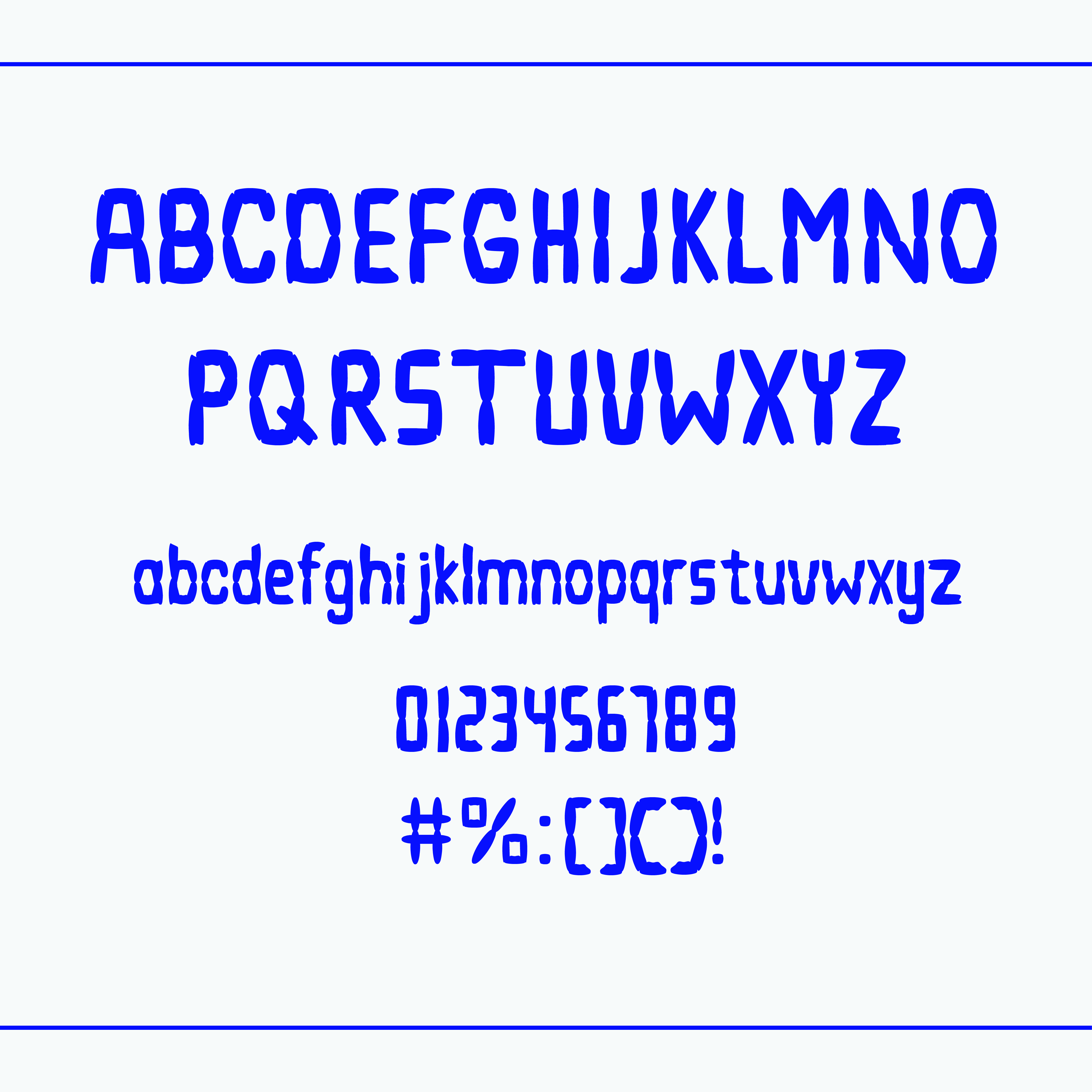
FINAL RESULT
Font: Sego
Font Presentation
 |
| Fig. 2.1 Font Presentation 1 (21/7/24) |
 |
| Fig. 2.2 Font Presentation 2 (21/7/24) |
 |
| Fig. 2.3 Font Presentation 3 (21/7/24) |
 |
| Fig. 2.4 Font Presentation 4 (21/7/24) |
 |
| Fig. 2.5 Font Presentation 5 (21/7/24) |
Font Application
 |
| Fig. 3.1 Font Application 1 (21/7/24) |
 |
| Fig. 3.2 Font Application 2 (21/7/24) |
 |
| Fig. 3.3 Font Application 3 (21/7/24) |
 |
| Fig. 3.4 Font Application 4 (21/7/24) |
 |
| Fig. 3.5 Font Application 5 (21/7/24) |
Week 8: Independent learning week.
Week 9 - Specific Feedback: Explore more, might be work for the font. Pixelated font could be risky, because there's a bunch of it.
Week 10 Specific Feedback: The circular shape is too rigid, also apply a grid structure to construct the letters, should start with 'H' and 'O'
Week 11 - Specific Feedback: The 's' looked okay
Week 12 - General Feedback: When create brackets, the bottom part is slightly bigger than the uppercase
Week 13 - Specific Feedback: Make the font presentation clean.
REFLECTION
Experience: I find it a little bit hard to keep up during this task and balance this module with other modules. But I feel like it's worth it because I might be a little bit slow but I know that I want to learn and keep going. This task opened my eyes because I have seen other's work and they did a great job. It motivates me to put more effort into my tasks.
Observation: Mr. Vinod already warned us about this task since semester 1, and it actually scared me T-T. But as I'm working on this task I feel like I've made something, even though not perfect. I also see that this task is very unique because there's no limit to looking for inspiration. This task really developed students' creative thinking skills, because it challenged us to be different than others and also more disciplined.
Findings: During my own process, I went through a lot of trial and error until I could finish the whole letter. Through that process, I can finally get the typeface that I want (maybe still needs more refining), but I am happy because from those mistakes I can learn to be more detailed in doing my task.
 |
| Fig. 4.1 The Science of Typography by Ellen Lupton (2004) Read here |
The essay talks about the scientific research on typographic efficiency. It focuses on how various typographic variables such as the number of words per line, font style, and the media (screen or paper) could affect readability and legibility. In this essay, several studies were mentioned, the study came from various backgrounds, for example, psychology and human-computer interaction. These studies often yield inconclusive results, showing the complexity and interaction between these variables. However, the point is that the key findings include the optimal size for reading and user preferences for screen fonts, this shows that human has tolerance for typographic variation. The essay highlighted the elasticity of typographic system and challenges conventional design assumptions.


Comments
Post a Comment