24/4/2024 - 4/8/2024 (Week 1 - Week 14)
Aisya Diva Anwagodsa (0365505)
Interactive Design / Bachelor of Design (Hons) in Creative Media
Final Compilation
INSTRUCTION
SUBMISSION
About Website:
Lyon-Beton is a website that showcases its furniture products. They provided furniture that has a concrete style and explores the combination of geometric shapes that can be a philosophy of life, such as the De Stijl school, Brutalism, Art Deco, etc.
Here is the quick look of the website:
Fig. 1.1 Lyon-Beton Homepage
(1/5/2024)
Purpose & Goals
Lyon Beton is a website that provides a service of custom furniture and unique furniture that carries bold and minimalist aspects. They also have a great vision of furniture usage, where they do not want to create furniture that only follows trends, but they want to make something that is timeless and strong for a long period. This website is dedicated to attracting more buyers and introducing their concept to more people.
Visual Design & Layout:
Fig. 1.2 Lyon-Beton Layout
(1/5/2024)
Lyon-Beton has a minimalist and eye-pleasing appearance. They optimized the layouts by using a monochrome theme and big fonts to lead our sight into the product pictures. Looking into the layout of the article, they applied the different concepts, because there are only a few pictures so people can be focused on the text. The minimalist concept that they used was attractive, and the placement was on point. As a user, I would like to come back to the website and maybe buy something from it.
Functionally and Usability:
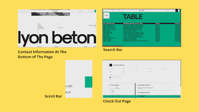.gif) |
Fig. 1.2 Fuction And Usability
(30/5/2024) |
Because most of the website uses monochrome color, It was surprising to see green color pop up on the search bar, but it suited the theme of the website. They also balance the minimalist theme with interactive features such as moving pictures or animated icons. One thing that I noticed was, that they added a unique scroll bar on the right side to make user easy to scroll down to the end of the page because on some websites we might find a boring grey scroll bar, instead of green colored scroll bar. This website also provided information such as contact number, address, social media, etc. Also, the font selection was smart, it complements each element on the website, so the website creates a harmonious look and gives users a good experience.
Content Quality & Relevance:
 |
Fig. 1.4 Website's Content
(30/5/2024) |
The content quality & relevance of Lyon-Beton was excellent. The appearance and resolution are at their best, especially since it is a website that sells things, Lyon-Beton can convince the user as they are providing the picture of their product with high-quality resolution. They are also putting a journal on their website so users can see the history of their work, collaboration, and things that are related to the product.
Performance:
Fig.1.5 Performance Laptop Vs Phone
(1/5/2024)
Technically, Lyon-Beton's website could give users a good experience at performance. In a big device such as a laptop, there is no lagging and it loads pretty quickly, Another thing that we have to consider is the internet connection of the device could affect the performance because a website's performance works differently on a mobile phone.
Strength & Weakness:
Strength:
- Has a good design & layout.
- Works very well on a laptop.
- Providing journal/history of some of their work as a reference.
- Not only selling product, but also communicate with users through their journal page.
- Has interesting feature (Moving bar, changing pictures, etc.).
Weakness:
- Giving a different experience when user opens it on a mobile phone.
Conclusion:
Overall, Lyon-Beton was an interesting website. It is so complete from A to Z, they have a unique concept and provide all of the information that users need. Another thing that would make the user experience better in visiting this website is, that using pc/laptop would be recommended.
Words: 584
Fig. 2.1 Website Preview
(1/5/2024)
About Website:
Wilde Weide Festival is a website that introduces the creativity of music festival and it is performances. This website sells tickets for its festival that will happen from the 5th to the 7th of July in the Netherlands.
Purpose & Goals:
As it's a festival website, of course, the main purpose is to promote the festival to reach more people. Besides the festival tickets, they also sell camping spots for the accommodation. Based on the observation, this website also has a dedication page for artists, so people can discover different artists that they never knew before.
Visual Design & Layout:
.jpg) |
Fig. 2.2 Website's Layout
(1/5/2024) |
This website has a very unique concept, it uses pop color and unique graphic elements that appear on every page of this website. It is quite bizarre, but the bizarreness makes this website stand out. The placement of the contents is very good. They were also very brave to replace the cursor with the goat-head, instead of an arrow. For some people, it can be very confusing to look at this website, but it is exciting at the same time.
Function & Usability
Fig. 2.3 Function & Usability
(1/5/2024)
As written before, Wilde Weide has a 'unique' concept, some of its features like the main menu are full of graphic elements, so people can mistake that for a button to the main menu or website's content. They placed the menu on the left upper corner of the website. Then, the menu will lead the user to another page with animated graphical designs that dominate the page, so people might not realize that the content is there. Maybe, because it is a festival website they want to be playful and give another level of experience to the user. For the content, this website has a separate page for each content, which is good, and they toned down the graphical elements, to minimize distraction. They even have a special page dedicated to introducing the artists and embedding the artist's platform.
Content Quality & Relevance:
Fig. 2.4 Content Quality & Relevance
(1/5/2024)
Both the quality and relevance of this website work very well, especially in giving such a weird yet astonishing experience for the user. Because of its playfulness, people will not be bored in exploring this website. They also added sound to the website, so people could scroll while listening to the music that suits them very well with the festival, that is why this website is relevant to its concept and brings the festive Wilde Weide experience to the user.
Performance:
Fig. 2.5 Web Performance Laptop Vs Phone
(1/5/2024)
Since Wilde Weide uses a lot of graphical elements, this website works very well on a laptop. The animation works smoothly both on a laptop and a mobile phone, there was no lagging on this website which enhances the attractiveness of the website.
Streght & Weakness:
Strength:
- Has very unique design.
- Worked smoothly on mobile phone/laptop.
- Giving a very unique experience.
- Every graphical elements in it is animated and suits the concept very well.
Weakness:
- Might be a little bit confusing for some people, because of its graphical elements.
- The goat-head cursor animation was too much, but it is not that bad.
Conclusion:
Wilde Weide is a good website, where people can discover new things, new styles, and cool graphical elements. It can also be studied by those who work in the design industry because it gives inspiration and reference for design.
WEB REPLICATION
Final Outcome
 |
Fig. 3.1 Clean Bandit Replicate
(9/5/24) |
 |
Fig. 3.2 Ocean Health Index Replicate
(15/5/24)
|
<iframe src="https://drive.google.com/file/d/1kyKb5PF36UwobJmby3i6Ac0SCjX8RKxS/preview" width="640" height="480" allow="autoplay"></iframe>
(15/5/2024)
RECIPE CARD
 |
4.1 Recipe Card PNG
(2/6/24) |
4.2 Recipe Card PDF
(2/6/24)
https://tempe-spici-188.netlify.app/
PROJECT 1: CV PROTOTYPE
.png) |
Fig. 5.1 CV Prototype
(30/5/24) |
Fig. 5.1 CV Prototype PDF
(30/5/24)
PROJECT 2: WORKING WEB
https://wonderful-aisyacv-d3025e.netlify.app/
.png) |
Fig. 6.1 Working Web PNG
(29/6/24) |
Fig. 6.1 Working Web PDF
(29/6/24)
FINAL PROJECT
Fig. 7.1 The Enigmatic Poirot Web PDF
(3/8/24)
Fig. 7.2 HTML The Enigmatic Poirot PDF
(3/8/24)
Fig. 7.2 CSS The Enigmatic Poirot PDF
(3/8/24)
REFLECTION
Experience
This module has its owns difficulty levels that I cannot compare to other modules. As a student, this is probably the first time in my life to learn about literal coding. Especially the final task, because it took a lot of time and patience. But I can say that this module was fun even though it was difficult because the feeling that I get when I can make a website (even though it is not perfect) was amazing, like I said, first time in my life that created a website from scratch, what a nice experience.
Observation
Coding is something that you can learn by yourself, but this module is like a guide so I can learn slowly but surely to understand 'what interactive design is' I also discovered that a lot of practice is very important because if we only know about the theory, it would be hard for us to apply the knowledge. As a beginner, trial and errors are my best friends through out this module, I can't wait to learn advance Interactive Design.
Findings
Time management is crucial for this module. I also discovered that there are a lot of things that you can create with HTML & CSS code, you can make a fascinating design by only using words (code). While coding we should pay attention, in order to prevent error.
.gif)

.jpg)


.png)
.png)


Comments
Post a Comment